Fluid Interaction Revisited
Prof. Dr. Harald Reiterer, 10.01.2024
The article is based on a series of talks I have given at different institutions entitled “Fluid Interaction for Visual Data Analysis”. It is an extended version of my speaker notes, and it aims to allow interested listeners to reflect on it in more detail and to dig deeper into the ideas and insights. For people who have not attended the talk, this article is an opportunity to get an idea about its content. This article reflects on more than ten years of research on the topic Fluid Interaction for Information Visualization. The conclusions and gained insights reflect my opinion. However, it is essential to mention that the presented ideas and prototypes have been developed with numerous PhD and student researchers in our Human-Computer Interaction Group over a decade together with researchers form other Labs and Universities (see acknowledgement). I am very thankful for their tremendous work and for joining me in my research endeavor in Interaction and Visualization Research.
Introduction and Motivation
My talk and the accompanying article are structured in the following manner: After introducing the motivation and fields of study, the research focus behind fluid interaction is explained. Then, I will present different exemplary design solutions and some results, testing them with users or experts. These design solutions should make the different properties of Fluid Interaction more vivid. The conclusion summarizes the main insights and gives an outlook on future research.
Fields of Study
My fields of study since my PhD in 1990 are the field of Interaction Research and Visualization Research. Interaction Research, also called Human-Computer Interaction (HCI), is “A discipline concerned with the design, evaluation and implementation of interactive computing systems for human use and with the study of major phenomena surrounding them” (Hewett T. et al. 1992). The other field of study that caught my attention very early is the field of Visualization Research. It studies “The use of computer-supported interactive, visual representations of abstract data to amplify cognition” (Card S. et al. 1999). Why did this combination of interaction and visualization research gain my interest?
Why Interaction?
Interaction has a central role in visualization. Interaction is the catalyst for the user’s dialogue with the data and, ultimately, for attaining insights and understanding. The dialogue between the user and the system is what sets Information Visualization apart from statistical data graphics and infographics; and it is clear this is where the true potential of visualization comes to the fore.
Figure 1: FilmFinder (Ahlberg and Shneiderman 1994)
The work from Ben Shneiderman had a tremendous impact not only on my research, but on visualization research in general. For me, his dynamic query idea realized in the FilmFinder application was one of the most convincing applications to show the power of interaction in visualization research (see Figure 1). The idea of combining powerful filter controls (like the Alphaslider, and Rangeslider) with a direct manipulation technique called dynamic query and using a scatterplot called starfield display to visualize the results of a database fascinated me. Maybe I was a little biased because I did my PhD in developing ergonomic user interfaces for office automation systems under the supervision of Professor A Min Tjoa, at the time of my PhD a database researcher at the University of Vienna. One of the pressing problems in database research in the late 80ies was that we had powerful rational database systems but only poor user interfaces to get access to all the data in them. Query by example from IBM (Zloof 1975) was one of the few examples that tried to address the requirements of novice users having no deep knowledge of SQL queries. For me, dynamic queries have been a much more convincing answer to this problem, and I started to dig deeper into interaction and visualization research.
Figure 2: Interactive Visualization Systems
In the following, I want to present more than ten years of experience designing and testing interactive visualization systems (see Figure 2). I also will show how essential visions have been for my research. In 2010, I attended a Dagstuhl Seminar about “Information Visualization”. In one of the breakout groups, we discussed what makes an interactive visualization system successful and the critical characteristics to reach this goal. The result was a vision paper called Fluid Interaction for Information Visualization (Elmqvist et al. 2011). This vision paper inspires my research to be impactful, and as you can see, our HCI Group developed a variety of systems which try to address these characteristics. I will use them as exemplary design solutions to make the abstract characteristics easier to understand. There are hundreds of possible ways to do so, and I am sure there are better ways. Nevertheless, all systems I will present have been published at the CHI conference series, the major conference in the HCI community undergoing a careful peer review process.
Fluid Interaction - Hypothesis and Properties
So, what does Fluid interaction mean? We came up with these three characteristics of Fluidity in visualization research designing visualization tools:
- tools with smooth, seamless, and powerful interaction;
- tools with responsive, interactive, and rapidly updated graphics; and
- tools with careful, conscientious, and comprehensive user experience.
We hypothesized that “Visualization tools that exhibit this fluidity in all aspects will transform the sensemaking process into an efficient, illuminating, and even enjoyable experience because it helps the user stay in flow of the work process.” (Elmqvist et al. 2011).
As you can see, the Flow Theory was essential for us. The influential book from Csikszentmihalyi called “Flow: The Psychology of Optimal Experience”, published in 1990, summarizes the ideas behind the Flow Theory (Csikszentmihalyi 1990). It got much attention in the HCI community because it is about an optimal experience. In HCI, one of the important goals is to design systems that evoke a great user experience. Therefore, we hope to learn from this theory what could be essential characteristics of interactive systems to reach such an optimal experience.
So, to reach the mentioned characteristics, we defined the following three properties of a fluid interactive system:
- it minimizes the challenge of interacting,
- supports direct manipulation, and
- promotes flow.
Figure 3: Facet-Streams
The development of these properties was strongly inspired by our visualization tool called Facet-Streams published 2011 (Jetter et al. 2011) (see Figure 3). Like the FilmFinder, we used a dynamic query approach materializing the filters with the help of physical tokens on a tabletop and showing the connection between them with a filter flow visualization. The impact of the filters on the result set was delivered immediately, and different users could collaborate during the search activity. We compared Facet-Streams with a conventional WIMP user interface to search for hotels using the website from HolidayCheck as blueprint. The task was to find a hotel that fulfil specific criteria of a group of users (e.g., family spending their holidays together). The results have been so convincing that we used Facet-Streams as one of the exemplary systems to reach the properties of Fluid interaction in our article (Elmqvist et al. 2011).
Now, let’s discuss the three properties of fluid interaction in more detail.
Fluid Interaction minimizes the challenge of interacting
Minimizing the interaction challenge is one of the primary goals of designing interactive systems. It is a prerequisite for gaining a great user experience. Because good usability reduces the cognitive load when interacting with visualization tools. The fewer resources the users must spend to operate the tools, the more resources are left to interpret the visual representation and gain insight.
To reach the property “minimize the challenge of interacting”, lead to the following question: “How can we guide the design process, and what methods and techniques should we use to reach a high usability of visual data analysis tools?”
Figure 4: The Agile UX approach (Hartson and Pyla 2018)
The good news is that we have a well-established design lifecycle in Interaction Research, like the Agile UX approach from shown in Figure 4 (Hartson and Pyla 2018). The Agile UX approach offers various methods and techniques to design for a quality user experience. These methods and techniques are the core of Interaction Research and, for me, a prerequisite that each Interaction Designer must know. This holds not only for commercial products but also for research systems! This is often neglected in academia. The argument is “We are different in research because ...”. I disagree. This “we are different argument” is often an excuse to take shortcuts (e.g., no solid requirements based on user needs; poor testing). Ill-designed systems are often used in user studies with fundamental usability flaws. Overcoming these flaws is then discussed as an essential insight of the study. This is unprofessional and a waste of time (and money). Testing is a necessary part of the UX design lifecycle, which means starting early with design walkthroughs and formative evaluation before running user or expert studies.
Fluid Interaction supports direct manipulation
The next property of Fluid Interaction is to support direct manipulation like the dynamic queries in the Film Finder or Facet-Streams (Jetter et al. 2011). The development of the direct manipulation concept in Facet-Streams was inspired by the Reality-based Interaction (RBI) framework from Jacob et al. (2008). The aim is "to make computer interaction more like interacting with the real, non-digital world" (Jacob et al. 2008). The expectation is that "basing interaction on preexisting real-world knowledge and skills may reduce the mental effort required to operate a system because users already possess the skills needed" (Jacob et al. 2008). For example, graspable filters like our glass tokens on the tabletop support direct manipulation by directly interacting with the domain objects and minimizing the interface's indirection.
The four themes of reality (see Figure 5) help to structure the design domain in addressing users' naïve physics understanding as well as different user awareness and skills, which should be considered.
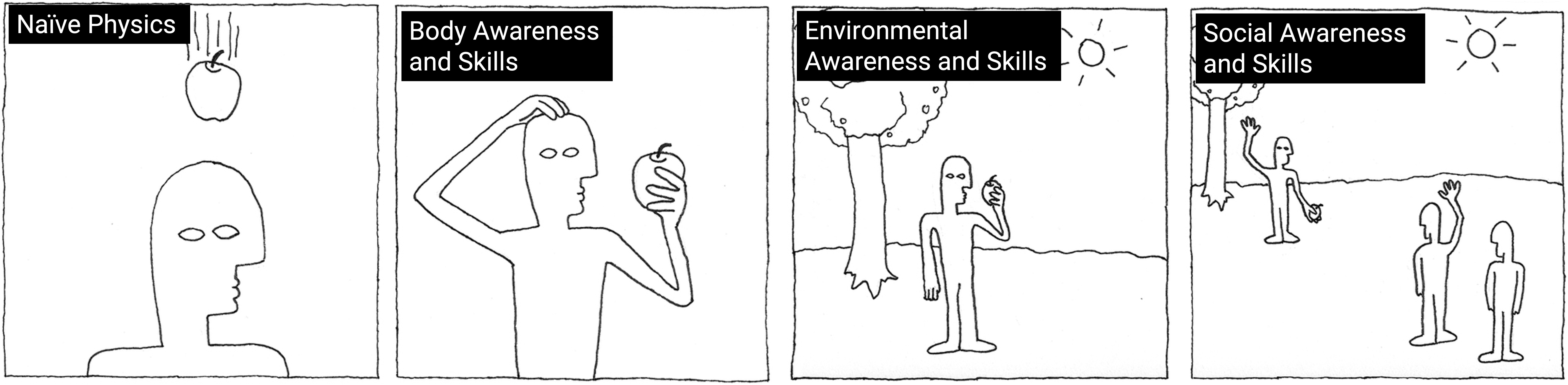
Figure 5: Four Themes of Reality (Jakob et al. 2008)
To overcome one of the limitations of the RBI framework, we developed our Blended Interaction Framework (Jetter et al. 2014). The main limitation of RBI, if taken literally, is that it underestimates the expressive power of digital tools. The "magic" or "superpowers" of digital tools distinguish them from real-world tools and constitute their expressive power. This leads to the research question: How can we design powerful and expressive digital tools without overwhelming the user? How can we ensure that the users gradually increase their understanding of handling the device?
The conceptual integration theory gives answers to these questions because it explains how user interfaces that share only selected aspects with a familiar concept (like in Reality-based Interaction) can still be adopted by users, even though some of its behaviors might appear unrealistic and unfamiliar (like in Immersive Interaction). So, our Blended Interaction framework took the four themes of reality from RBI as a starting point (see Figure 6 - a simplified schematic model of the BI framework, for details, see Jetter (2014)). Then we used the conceptual integration theory from Fauconnier & Turner, published in 2002 in their book "The Way We Think" (Fauconnier & Turner, 2002) to extend the RBI framework (Imaz and Benyon were the first from the HCI community to use this theory in interaction design, published in their book "Designing with Blends" (Imaz and Benyon, 2007)). A blend is a conceptual integration that creates a new concept from two existing input concepts. The resulting output concept is called a blend and has an emergent new structure that is unavailable from the inputs. Blends explain how user interfaces that share only selected aspects with a familiar concept can still be adopted by users, even though some of its behaviours might appear unrealistic and unfamiliar. This is where the magic comes in! As further support for the designer, we structured the Design Domain in four subdomains, which we call individual interaction, social interaction, workflow, and physical environment. Often, all four Design Domains must be addressed holistically.
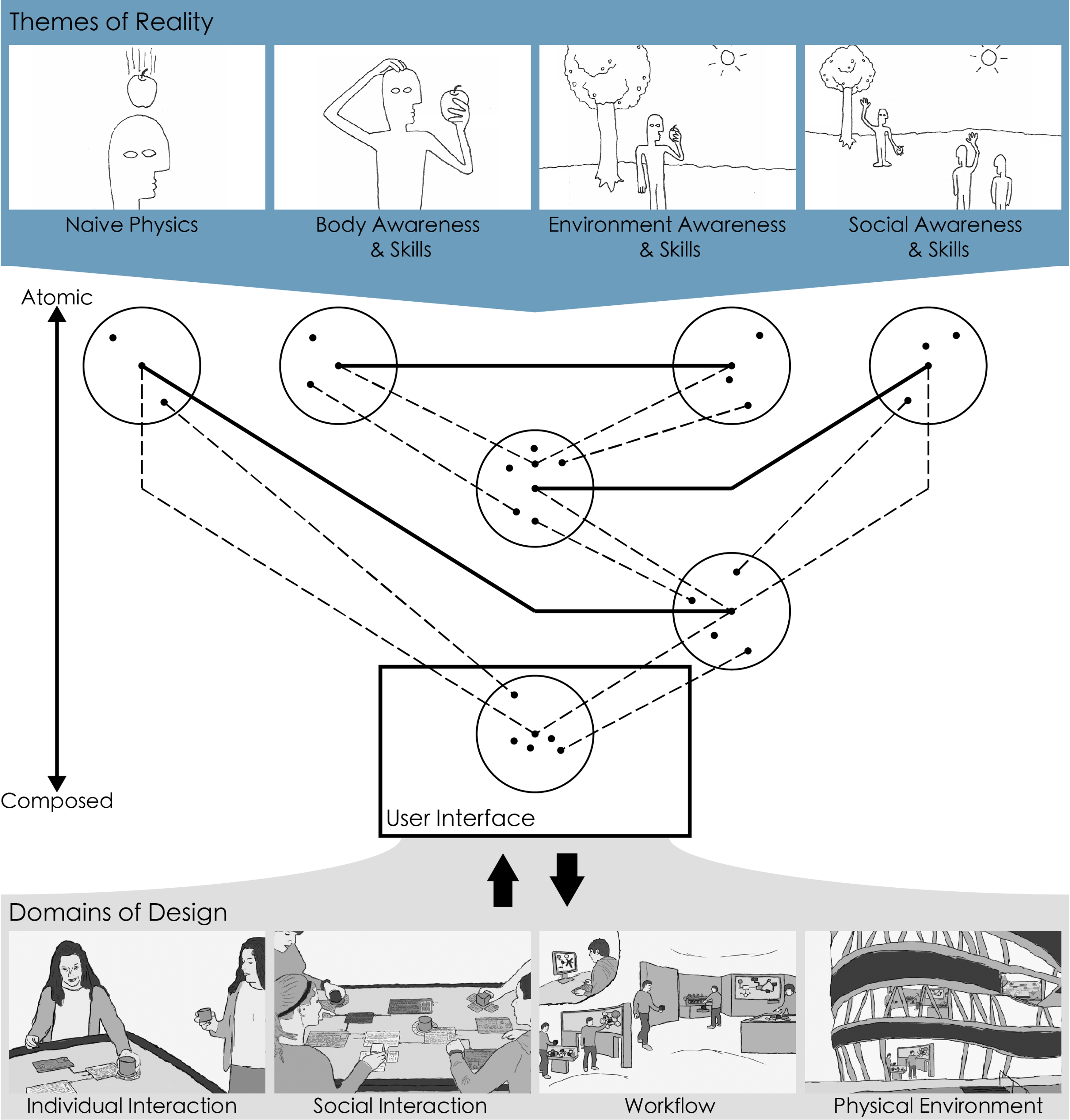
Figure 6: The Blended Interaction framework
To reach the property of Fluid Interaction, to support direct manipulation, lead to the following question: "How can we guide the design of direct manipulation, and can this type of interaction leverage human capabilities and human-embodied knowledge to facilitate interaction with visual data analysis tools?"
Our answer was using the RBI framework from Jacob et al. (2008) and extending it with Blends, as I have explained before. We called this new framework Blended Interaction, and we developed and tested various design solutions in different application domains like museums & exhibitions, control rooms, design studios and visual search systems for libraries.
Fluid Interaction promotes Flow
The third property of Fluid Interaction is that it promotes Flow. The aim is to immerse the user in an activity and into the data using 3D data visualizations combined with immersive user interfaces. The immersion is based on sensory output with high fidelity, multi-modal input, body-based navigation, and direct manipulation. The expectation is that Immersive Interaction promotes staying in the Flow. Flow is defined as total immersion in an activity and into the data, leading to a high focus, involvement, and rewarding outcomes.
The field of Immersive Analytics (Chandler et al. 2015) combines 3D data visualizations with immersive user interfaces. In 2016 I attended a Shonan Meeting called "Immersive Analytics: A New Multidisciplinary Initiative to explore future interaction technologies for data analytics". Like the Dagstuhl Seminar about Information Visualization in 2010, this event was an excellent opportunity to discuss ideas with international experts and tremendously impacted my research. Our system, ART, which I will present later, is a direct result of attending this Shonan Meeting.
Figure 7: Immersive Analytics (Chandler et al. 2015)
To reach the property to promote Flow, lead to the following question: "How can we guide the design of Immersive Interaction, and can this type of interaction leverage total immersion in an activity and into the data, leading to a high focus, involvement, and rewarding outcomes?” Our answer was inspired by the Flow Theory from Csikszentmihalyi (1990), developing design solutions using 3D data visualization and immersive user interfaces using sensory output with high fidelity, multi-modal input, body-based navigation, and direct manipulation (see Figure 7). This new visualization approach is called Immersive Analytics and plays an increasing role in the Visualization Community (Chandler et al. 2015).
Now, the stage is set to present some exemplary design solutions that address Fluid Interaction's properties. Hopefully, my examples will convince you that Fluid Interaction is a valuable approach to designing interactive visual data analytic tools. Maybe some design ideas will inspire you creating your own systems.
Exemplary Design Solutions to support Fluid Interaction
CollectionDiver – A visual search system for a Public Library
All the following examples are grounded in a solid UX design lifecycle consisting of the four steps of interaction design for a quality user experience:
- Understand user work and needs.
- Create interaction design concepts.
- Realize design alternatives with prototypes.
- Verify and refine interaction design and iterate.
Following such an UX design lifecycle addresses the first property, "Fluid Interaction minimizes the challenge of interacting". For example, before we developed the system CollectionDiver, which is a visual search tool for an online catalogue in a library, we made a comprehensive requirements analysis in different public libraries in Colone, developed different prototypes, and evaluated them with experts before we set the final system to run a study in the wild.
The proposed direct manipulation via graspable filter tokens and using direct touch on touchable horizontal and vertical surfaces follows a Tangible Interaction approach. It is a natural successor of our facet-streams system. The chosen design solutions use different blends following our Blended Interaction framework (e.g., filter-flow metaphor using different types of valves to control the flow of data).
External Page
To view this content (source: www.xyz.de ), please click on Accept. We would like to point out that by accepting this iframe, data could be transmitted to third parties or cookies may be stored.
You can find more information on our privacy policy .
Figure 8: CollectionDiver
To promote Flow and Immersion we used 2D visualizations like the filter-flow stream to show the filter's strength and the filter token's position to control the filter effect (Boolean “AND”/”OR”) and a grid-like table to show the results.
The video in Figure 8 explains the main workflow using CollectionDiver. Physical tokens are used to filter the media of the online catalogue. They are placed on the rim of the tabletop. Now, the user can grasp one or more of these tokens. Their shape represents different types, like language, media type, time, author, or search term. The user can adjust by touching the range of the filter (e.g., time) or entering words (e.g., search terms or author name). All filters on the tabletop are implicitly connected with a Boolean "AND" visualized via dynamic filter bubbles. But if the user places two search term tokens nearby, they relate to a Boolean "OR". This is pictured with a unified shape around both tokens. So, in front of the user, a transparent representation of the whole query process is shown and how strong the filter effect of the different filters is. This information guides the user in adjusting the result set, avoiding a zero-hit or overwhelming large result set. The matching results are always shown immediately as a list on the horizontal display before the user. The user can select an item of interest via touch, leading to further information about this item (e.g., more metadata and the location of the media in the library). A small printer prints the metadata and the way to the media on the shelf for each selected item on a stripe, like for a cashier.
Figure 9: In-the-wild user study
We conducted an in-the-wild study comparing our system with the existing online web catalogue UI at the Public Library of Cologne (see Figure 9). In the study, 33 library visitors (11 male) had to search for books on topics of interest. Twelve have been individual participants, and ten have been in small groups of two or three. We had a broad range of age groups ranging from 18 to 64. Most participants have been familiar with the online catalogue. We measured the effectiveness (could they find a book) and efficiency (how long it took) and asked questions about the cognitive demand. We also got a lot of qualitative data from observations using video recordings.
Figure 10: The online catalogue (left) and CollectionDiver (right)
On the left of Figure 10, the existing online catalogue is shown. The search criteria are based on textual input. The search terms, the filter criteria, and the results are integrated into one view. The information structure is layered. On the right of Figure 10, the CollectionDiver is shown. The search criteria are a combination of tangible filter tokens, textual input using a digital keyboard, and visual elements as the filter-flow stream. The information structure is flat.
Our qualitative comparative study shows that, while the CollectionDiver enables a similar search process as a typical online catalogue interface, it positively influences participants' experience and engagement. Therefore, we recommend materializing the query using tangible objects because this facilitates the query construction collaboratively and playfully. Tangible objects leverage users' knowledge about Naïve Physics, Body Awareness and Skills, and Social Awareness and Skills. We also recommend visualizing the individual query components in terms of chosen filter settings for individual attributes and displaying how they relate. This visualization increases the transparency, provides a rationale for the items in the result set, and motivates a proactive approach to search.
ART - An Immersive Analytics System for nutrient and exercise Data
The next example is an immersive analytics system called ART (see video in Figure 11) (Butscher et al. 2018). ART stands for “Augmented Reality above the Tabletop”. Its design is grounded in our positive experience evaluating our systems called Facet-Streams (see Figure 3) and CollectionDiver (see Figure 8). In both systems, the visualization of filter effects using a filter flow stream has been well-received during our lab and in-the-wild studies. Also, the chosen interaction using direct manipulation with touchable horizontal surfaces and tangibles was well appreciated.
External Page
To view this content (source: www.xyz.de ), please click on Accept. We would like to point out that by accepting this iframe, data could be transmitted to third parties or cookies may be stored.
You can find more information on our privacy policy .
Figure 11: Augmented Reality above the Tabletop
Nevertheless, tangibles had some practical and technical limitations, like you can lose them, and their dedication on the surface came with some technical issues. Therefore, we decided to use only touch interaction without tangibles on a large horizontal surface. To increase the immersion and flow effect, we decided to replace some 2D visualizations with 3D visualizations using AR HMD instead of conventional displays. This setting should allow the user to dive into the data and use more space.
Figure 12: Approaching the tabletop
When the user approaches the tabletop (see video in Figure 12), he must trigger the first filter with two representations, a 2D scatterplot on the tabletop and another 2D scatterplot in space above the tabletop.
Figure 13: Defining values
The video in Figure 13 shows how the user defines the x- and y-axis values and then the scatterplot above the tabletop flips from a frontal view to a side view to save space. Now, the user triggers another filter on and above the tabletop and selects the x- and y-axis values. The two filters are automatically connected with parallel coordinates.
Figure 14: Adding filters
Again, the user adds another filter and the filter-flow visualization above the tabletop increases (see video in Figure 14). Finally, four scatterplots connected with parallel coordinates are placed above the tabletop.
Figure 15: Touch interaction on the tabletop
The whole interaction with the filter-flow visualization is based on the touch interaction on the tabletop (see video in Figure 15). This kind of interaction is well-known and robust. The tabletop offers a clear frame of reference for the user. He can move the filter-flow visualization on the tabletop from left to right or forward and backward, walk along the tabletop or look from the short front side of the filter-flow visualization. The selection of data points or the colouring of data points is all done with the common touch interaction on the tabletop.
Figure 16: Collaborative activities
ART supports a collaborative setting because two users can analyze the filter-flow visualization in a tightly coupled manner (see video in Figure 16). But only one user could interact at the same time. The other user is then a bystander and could discuss and analyze the shown data equally. Again, the tabletop offers a clear frame of reference for both users.
Figure 17: Evaluating ART
The evaluation was conducted as a Lab Study in our Lab (see Figure 17). Our participants have been ten domain experts, namely health psychologists from our university (PhDs, PostDocs), split in 2 x 5-person groups. They know the data dimensions and the topics of the analysis. Their analysis aims and tasks have been constructed with them to make the evaluation more realistic. It was the first time for them to analyze the collected data. All had experience in using SPSS, Excel, and Tableau. In short, our psychologists gained surprising insights which triggered specific research questions. They told us this would not have been possible with their previously used tools for data analysis. They collaborated a lot and had intensive discussions.
The evaluation was designed to answer two research questions:
- What benefits and drawbacks does the provided combination of an AR environment with touch input come with?
- Are ART's AR environment and interaction techniques suitable for collaborative data analysis?
Here, our findings related to the first research question – the combination of AR and touch.
- The users understand and like the filter flow visualization combining 2D scatterplots and parallel coordinates in 3D.
- Touch input allows fluid operation because users feel safe and convenient.
- AR provides ample scale space to visualize information. Users could walk along the data and look from different views (long side, short side).
Figure 18: Domain experts analyzing their data with ART
Here are some findings related to the second research question about collaboration.
- We could see a lot of collaborative actions, so the user's social awareness and skills could unfold (see Figure 18).
- Tightly coupling styles are well facilitated, but only one big input device was also a limitation for loosely coupled collaboration. Therefore, AR should also provide the means to facilitate loosely coupled collaboration.
Our evaluation with ten domain experts led to a lot of helpful insights. We analyzed the video recordings of two workshops and condensed our findings into three design recommendations.
- We recommend displaying 3D visualizations in AR to facilitate comprehension. AR environments provide important depth cues through stereoscopic vision, allowing natural body movement to navigate the visualization. Users can apply their knowledge about Naïve Physics, Body Awareness and Skills, and Environment Awareness and Skills navigating and interpreting the visualized data.
- The AR environment further allows for natural communication and coordination and leverages users' Social Awareness and Skills for Social Interaction. We recommend utilizing touch input for AR environments to allow for familiar and fluid interaction.
- Finally, facilitate combined navigation styles for egocentric and non-egocentric navigation to support collaboration. This last design recommendation triggers the technical setting of our follow-up visual analytic system called STREAM.
STREAM - Spatially-Aware Tablets with Augmented Reality Head-Mounted Displays for Immersive Analytics
We developed STREAM as a follow-up system based on the insights developing and testing our ART system. STREAM stands for "Spatially-Aware Tablets with Augmented Reality Head-Mounted Displays for Immersive Analytics". We started with a similar setting like in ART (see Figure 19) (Hubenschmid et al. 2021). We kept the idea of using the visual filter flow combing scatterplots and parallel coordinates because it was well appreciated during our expert evaluation.
Figure 19: From ART to STREAM
But we decided to overcome the restrictions of one large touch input interface - the tabletop - and the cable-bounded HMD (see Figure 20). Even one big input device was a valuable frame of reference; it hinders concurrent interactions, restricting tightly coupled collaboration.
Figure 20: Removing the tabletop
The new setting combines spatially aware tablets with wireless AR HMDs (see Figure 21). The main benefits are more flexibility for the collaboration styles (loosely and tightly coupled) and no cable-bound HMD, which supports head-gaze and speech interaction, increasing the interaction modalities.
Figure 21: Combining spatially-aware tablets and head-mounted AR
Again, our Fluid Interaction properties have been considered. The direct manipulation approach is now multimodal, combining direct touch, head gaze, and speech.
Flow and immersion are supported by combining 2D scatterplots on the tablet and 2D scatterplots connected with parallel coordinates in 3D using the space around the user.
Figure 22: Filter-flow visualizations
There is no single frame of reference, like the Tabletop in ART. This offers the user more flexibility in using space, e.g., having complex branches or parallel streams of filter-flow visualizations (see Figure 22). We've chosen our established 3D parallel coordinates visualization that consists of linked 2D scatter plots. Each scatter plot can be placed in a 3D space, and users can specify 2D areas that can filter out data from subsequent scatter plots. This flexibility comes with a price – orientation and navigation can become complex.
Figure 23: Eyes-free interaction
To cope with this increased complexity of our setting, we spent a lot of effort to support the user with a powerful multimodal interaction approach. In addition to the HMD's existing input modalities, such as Head-gaze and speech input, we employed the tablet's touch input and spatial awareness as a tangible input, thereby avoiding tiring and possibly imprecise mid-air gestures. However, this also means that users must switch their attention between the two different output modalities – the HMD and the tablet. Our STREAM prototype bridges this “split-attention” gap with the following novel eyes-free interaction techniques.
We created a novel eyes-free interaction menu on the tablet for general interaction that allows the user to interact with a selected visualization (see Figure 23). Users see the available menu actions on their AR HMD, as you can see on the bottom right picture-in-picture and can then press the corresponding corner of their tablet to perform this action without looking at the tablet.
Figure 24: Button placement on the tablet
A set of buttons in the middle of the tablet have an increased interaction cost as they require a display switch and are thus reserved for more severe actions, such as deleting an object (see Figure 24).
Figure 25: Supporting Multi-Modal Interaction
Figure 26: Placing scatterplots
In addition, users can enable voice commands by touching the tablet with both thumbs (see video in Figure 25). Once they're active, the AR HMD extends with all available actions. This is shown on the picture-in-picture on the bottom right. The green words are the names of the spoken commands.
The first step in using STREAM is to define and place a filter consisting of a 2D scatterplot (see video in Figure 26). When placing the scatterplot, users can use a head gaze for the general position, the tablet's physical position for rotation, and swipe gestures to control the distance of the scatterplot. In addition, scatterplots automatically snap to other nearby scatter plots, as can be seen by the alignment lines. This removes any height differences and facilitates the comparison of data between different scatterplots.
Figure 27: Interplay of tablet and AR contents
The tablet display size allows familiar touch interaction to directly manipulate the scatterplot's data. For example, users can easily search for dimensions in a list on the tablet and draw filters directly in a scatterplot on the tablet (see Figure 27). The changes instantly synchronize with the AR visualization, allowing users to observe the filter effects. These filters can also specify the line colour across all connected scatter plots, which helps to, for example, track clusters across different scatter plots.
Figure 28: Tablet-lens
Aside from our eyes-free interaction menu, STREAM alleviates the necessary attention switch between the AR visualization and the tablet through our novel "tablet lens" interaction technique (see video in Figure 28). Instead of looking down at the tablet to interact with the 2D visualization and thereby losing critical context, users can lift the tablet in front of themselves to activate this lens mode. The tablet automatically switches from the eyes-free interaction menu to the 2D visualization view. In contrast, the selected AR visualization will rotate towards the user, roughly matching the user's tablet position.
This 2D view also displays the links as 2D parallel coordinates visualizations on the tablet, eliminating any possible errors from the 3D perspective.
External Page
To view this content (source: www.xyz.de ), please click on Accept. We would like to point out that by accepting this iframe, data could be transmitted to third parties or cookies may be stored.
You can find more information on our privacy policy .
Figure 29: STREAM video figure
Our STREAM prototype aims to facilitate the interaction with 3D data visualizations in augmented reality with a multimodal interaction approach using synchronous hybrid user interfaces (see video in Figure 29). Although the development of our system was inspired to be used for collaborative scenarios, we first focused on a single-user scenario to show the principal feasibility of proposed design solutions.
Figure 30: Evaluating STREAM
Therefore, the user study we conducted focused on the research question: “How can users utilize the provided multimodal interaction capabilities of our specific device combination (synchronous hybrid user interfaces)?”
We used eight non-experts, which allowed us to shift our evaluation focus towards our interaction concepts. During the study, we also observed participants through an AR tablet, which inhabited the same AR space as our participant, allowing for a live observation of the study (facilitator on the right side observing the users AR view in Figure 30).
Based on our findings, we extracted design insights and research implications about using spatially aware tablets, multimodal interaction in AR, and general system usability.
The study insights convinced us that our hybrid user interface setting has great potential for data visualization tasks. Significantly, the eyes-free interaction can be a good fit for general hybrid user interfaces, as it allows users to benefit from a physical interface (e.g., tablet) while concentrating on the AR environment. The spatial awareness of the tablets using them as a tablet lens helped trigger the interaction in the proper context and reduce the attention split problem. Another helpful approach to minimize the attention split problem was the display of the available voice commands of the HMD and the four touch commands at the corners of the tablet in the AR Head-Up Display.
Whether the proposed setting using tablets instead of one big table as an input device improves the collaboration, especially the tightly-coupled one, is a topic of future research.
ReLive - Bridging In-Situ and Ex-Situ Visual Analytics for Analyzing Mixed Reality User Studies
My last exemplary system closes the loop to our Fluid Interaction journal paper published in 2011. Niklas Elmqvist and my team shared our experiences of the previous ten years and developed ReLive together (Hubenschmid et al. 2022). This system summarizes many insights we have gained developing and testing visual data analysis systems (see video in Figure 31).
External Page
To view this content (source: www.xyz.de ), please click on Accept. We would like to point out that by accepting this iframe, data could be transmitted to third parties or cookies may be stored.
You can find more information on our privacy policy .
Figure 31: ReLive video figure
In the last few years, Niklas Elmqvist and my team have run a lot of user studies evaluating MR systems. Some examples are shown on the left side of Figure 32. These studies not only result in a lot of data, which leads to the need for powerful analysis tools. They also lead to a need for new and often more complex metrics, such as metrics that characterize participants' movements, spatial arrangements, or collaborative workflows. Plenty of data and new metrics can lead to relatively complex analysis procedures.
In this regard, prior work has shown two different approaches shown on the right side of Figure 32. Some related work uses a non-immersive approach and, for example, use a desktop for data analysis, which often excels at an ex-situ analysis, as there is a rich ecosystem of well-integrated and cross-compatible applications.
In contrast, recent related work uses an immersive approach, for example, by visualizing data with augmented or virtual reality. This approach is often ideal for an in-situ analysis, as the immersion can be beneficial for investigating the environmental context and offer a better spatial understanding.
Figure 32: Evaluating Mixed Reality User Study Data
Developing ReLive, we assume that an analysis workflow for mixed reality user studies can benefit from both approaches, depending on the current goal. However, researchers must reconstruct their workspace when switching between these two approaches, preventing any false findings that might occur if this transition between them is not seamless.
This makes transitional interfaces in combination with hybrid user interfaces essential, allowing users to switch between these analysis approaches quickly (see Figure 32).
Figure 33: Combining immersive and non-immersive views
So, to take full advantage of both an immersive and a non-immersive analysis approach, ReLive combines an immersive VR view with a non-immersive desktop view (see Figure 33). Since we use two completely different devices with complementary characteristics, ReLive represents an asynchronous hybrid user interface where these devices are used sequentially rather than simultaneously. As a result, ReLive has a desktop interface suited for a holistic ex-situ analysis, where users can investigate aggregated study data. Alternatively, researchers can also put on a VR headset and relive an interactive spatial recording of a study. Both views are instantly synchronized, allowing researchers to switch between desktop and VR as needed, allowing for a seamless analysis.
Figure 34: ReLive's desktop view
So, let's first look at ReLive's desktop view (see video in Figure 34). We combined concepts from a computational notebook with a video editor interface. And like a computational notebook, we can create new configurable tools in a centre panel. So, for example, here, we measure the distance between two handheld tablets used during a study. We can add different sessions from this study by dragging in more data from the left panel to compare this metric across various participants. So now, each line represents the distance over time between two tablets in one study session.
Like a video editor, we can also look at media data and show video recordings from the study or look into a 3D scene replicating the original study environment. We can control the playback of this media data with a timeline interface in the bottom panel. Here, we can either play back the study as it originally happened or scrub back and forth for a specific point in time.
Lastly, we can explore the 3D scene replication by moving the camera around with our mouse and keyboard. Here, we can also use different perspectives, such as an isometric view from above or the viewpoint of a specific device.
But of course, there are cases in which viewing this non-stereoscopic 3D scene does not provide the whole picture.
Here, our VR view comes into play (see video in Figure 35). We put on a VR headset and switch to a fully immersive VR view, which allows us to analyze the study directly in-situ. This VR view is automatically synchronized with the desktop view.
This means it provides corresponding in-situ visualizations, such as a 3D trail visualizing the participant's movement or a measuring tape showing the distance between two tablets.
Also, you have access to the same features as on the desktop. For example, we can rewind or fast-forward to a specific point in time through a timeline panel. We can also access other features in a panel attached to the left controller. Here, we can manage existing visualizations or add new visualizations to the current scene.
For example, we can attach a frustum visualizer tool to both tablets to highlight what exactly is within the tablet's field of view.
This makes the VR especially suited for in-situ data analysis by using 3D visualization and the environmental context to provide more insights into a study participant's behaviour.
Figure 35: ReLive's VR view
So, depending on the task, the user may want to work in either the VR view for in-situ analysis or the desktop view for an ex-situ analysis. ReLive automatically synchronizes the application state between both views to make this transition easier. So, any change made in virtual reality is also instantly visible on the desktop and vice versa (see Figure 36). The 3D scene window on the desktop view also helps in this transition, as it provides a preview of the VR scene and allows for a glance into the in-situ analysis without having to put on a VR headset.
Figure 36: Synchronizing views
To validate our setting, we evaluated ReLive in a two-step evaluation process (see Figure 37). We first conducted an internal design walkthrough as a formative evaluation to further refine the ReLive prototype. Next, we conducted an expert user study, inviting five researchers from different labs with prior experience conducting and evaluating mixed reality user studies.
Figure 37: Evaluating ReLive
During the expert evaluation, we followed three main research objectives.
- For the first objective, we evaluated our chosen task allocation. In this regard, all experts agreed with our intended distribution of using a desktop view for an ex-situ overview of the data and using VR for an in-situ analysis of the details in its environmental context, akin to an overview + detail visualization.
- For the second objective, we examined the interplay between the in-situ and ex-situ analyses. Here, the synchronization was found to be essential for this kind of asynchronous hybrid user interface. However, we also observed a loss of orientation when switching between the desktop and VR interface, which could be further investigated in future work.
- Lastly, we looked at the general applicability of ReLive. While all experts were positive about our ReLive framework, many also saw great collaborative analysis potential.
We provided design insights and research implications based on our design of ReLive and a two-step evaluation process consisting of a design walkthrough and an expert user study. Here, we demonstrate the general applicability of our concept, show the benefits of bridging in-situ and ex-situ analysis, and provide insight into transitioning between immersive (VR) and non-immersive (desktop) visual analytics.
With our work, we contribute to the Grand Challenges of Immersive Analytics by offering a flexible analysis workspace and investigating the role of Immersive Analytics when analyzing mixed-reality study data. Our work contributes to the underrepresented field of transitional user interfaces by investigating the transition between a VR HMD and a desktop.
Conclusion and Outlook
In this article I introduced the concept of Fluid Interaction and used best-practice examples to illustrate the three properties we defined 2011. Now let’s reflect what are the main lessons learned after more than ten years of research addressing these properties in a variety of design solutions shown above. What is my takeaway message?
-
Property: Fluid Interaction minimizes the challenge of interacting.
Solution: Follow a strict Usability Engineering Design Approach (e.g., Agile UX approach from Hartson & Pyla 2018) because it minimizes the interaction challenge, and without good usability, all the rest is a waste of time and effort. The Agile UX approach offers various methods and techniques to design for a quality user experience. These methods and techniques are the core of Interaction Design and, for me, a prerequisite that each Interaction Designer must know. -
Property: Fluid Interaction supports direct manipulation.
Solution: Direct manipulation based on Reality-based Interaction Design Solutions promotes directly interacting with the data. Often, abstract data becomes tangible, and the users feel in control. RBI is suitable for public installation and inexperienced users because RBI lowers the threshold to master the tool. But for more experienced users, it wastes opportunities to make the interaction with the tool more powerful (digital "superpowers”). Therefore, don't take RBI too literally and combine themes of reality with blends (BI). Even though some of the interaction behaviors might appear unrealistic and unfamiliar (like in Immersive Interaction). Blends explain how user interfaces that share only selected aspects with a familiar concept can still be adopted by users, even though some of its behaviors might appear unrealistic and unfamiliar. This is where the magic comes in! -
Property: Fluid Interaction promotes flow.
Solution: Immersive Visualization and Interaction Design Solutions could promote flow by allowing total immersion in the sensemaking activity and into the data. Therefore, I recommend developing design solutions using 3D data visualization and immersive user interfaces using sensory output with high fidelity, multi-modal input, body-based navigation, and direct manipulation. Especially, Cross-reality interaction and a Hybrid User Interface use complementary strengths of input & output devices and visualizations allowing a high degree of immersion. We call this type of interface a Complementary Interface.
To sum it up, immersive visualization and interaction, direct manipulation techniques, and good usability have shown impressive potential for interacting with visualizations.
Figure 38: Writing vision papers
Finally, I want to mention the importance of writing vision papers for our research (see Figure 38). Our paper, Fluid Interaction from 2011, defines the characteristics and properties of visual data analysis tools and became an essential frame of reference for our work.
Especially developing design solutions for the properties "Direct Manipulation" and "Flow & Immersion", our Blended Interaction framework paper published in 2014 was beneficial. It is based on the insight that natural human-computer interaction takes our experience interacting with real-world objects only as a starting point but extends it with digital superpowers using blends. Immersive Interaction, promoted by Immersive Analytics research, is an excellent example of this type of superpower.
Our last visionary paper, "Complementary Interfaces for Visual Computing", published in 2022, is based on the insight that cross-reality interaction with hybrid user interfaces allows a combination of complementary strengths of input and output devices and visualizations. Nevertheless, our user studies have shown that there are still a lot of open research questions and challenges. Challenges we want to address in future research are ways to support smooth transitions between different devices and visualizations to optimize complementarity. Figure 38 shows them in more detail.
The idea of Complementary Interfaces is on the way to become a commodity. Niklas Elmqvist speculates in his newest article about future trends in data analytics: “We would summarize our takeaways using a single theme: device diversity. Basically, it is the varied and heterogeneous nature—as well as their effective utilization—of the individual devices involved in a sensemaking task that makes ubiquitous analytics powerful. … Each device involved in ubiquitous analytics should have a clear role that complements the other devices, and transitions between them should be seamless.” (Elmqvist 2023).
Also, commercial vendors like Apple consider combining different devices in their ecosystem in a complementary manner when they promote their new HMD Vision Pro. In one of the usage scenarios shown in a promotion video, a user wearing the HMD Vision Pro being in a video conference recognizes an alert on her smartwatch and then opens her laptop, which is automatically recognized as part of the ecosystem of input and output devices. Now, she can use the large screen of the HMD as output instead of the smaller laptop screen, but still using the convenient keyboard or touch pad on her laptop as input. Nevertheless, the way from a polished promotion video to robust daily use under authentic circumstances is challenging. But I am sure it is worth the effort.
Acknowledgements
First, special thanks go to my former PhD student, Hans-Christian Jetter. Without him, the ideas behind Fluid Interaction and Blended Interaction would never have become reality. Then, I am happy that I could convince the following PhD students of our HCI Group over the years to develop and test the presented research prototypes considering our Fluid Interaction properties. Without their tremendous effort, Fluid Interaction would still be “Paperware”: Simon Butscher, Jens Müller, Sebastian Hubenschmid, Jonathan Wieland, and Daniel Fink. Another special thanks go to my former PhD and now PostDoc Johannes Zagermann for driving the ideas behind Complementary Interfaces.
The following researchers from other Labs of our and other Universities have made significant contributions to our Fluid Interaction paradigm: Johannes Fuchs (University of Konstanz), Uta Hinrichs (University of St Andrews and now University of Edinburgh), Niklas Elmqvist (University of Maryland and now Aarhus University), Andrea Batch (University of Maryland).
References
Own work
- Simon Butscher, Sebastian Hubenschmid, Jens Müller, Johannes Fuchs, and Harald Reiterer. 2018. Clusters, Trends, and Outliers: How Immersive Technologies Can Facilitate the Collaborative Analysis of Multidimensional Data. In Proceedings of the 2018 CHI Conference on Human Factors in Computing Systems (CHI '18). Association for Computing Machinery, New York, NY, USA, Paper 90, 1–12.
- Niklas Elmqvist, Andrew Vande Moere, Hans-Christian Jetter, Daniel Cernea, Harald Reiterer, and TJ Jankun-Kelly. 2011. Fluid interaction for information visualization. Information Visualization. 2011 Oct;10(4):327-40.
- Uta Hinrichs, Simon Butscher, Jens Müller, and Harald Reiterer. 2016. Diving in at the Deep End: The Value of Alternative In-Situ Approaches for Systematic Library Search. In Proceedings of the 2016 CHI Conference on Human Factors in Computing Systems (CHI '16). Association for Computing Machinery, New York, NY, USA, 4634–4646.
- Sebastian Hubenschmid, Johannes Zagermann, Simon Butscher, and Harald Reiterer. 2021. STREAM: Exploring the Combination of Spatially-Aware Tablets with Augmented Reality Head-Mounted Displays for Immersive Analytics. In Proceedings of the 2021 CHI Conference on Human Factors in Computing Systems (CHI '21). Association for Computing Machinery, New York, NY, USA, Article 469, 1–14.
- Sebastian Hubenschmid, Jonathan Wieland, Daniel Immanuel Fink, Andrea Batch, Johannes Zagermann, Niklas Elmqvist, and Harald Reiterer. 2022. ReLive: Bridging In-Situ and Ex-Situ Visual Analytics for Analyzing Mixed Reality User Studies. In Proceedings of the 2022 CHI Conference on Human Factors in Computing Systems (CHI '22). Association for Computing Machinery, New York, NY, USA, Article 24, 1–20.
- Hans-Christian Jetter, Jens Gerken, Michael Zöllner, Harald Reiterer, and Natasa Milic-Frayling. 2011. Materializing the query with facet-streams: a hybrid surface for collaborative search on tabletops. In Proceedings of the SIGCHI Conference on Human Factors in Computing Systems (CHI '11). Association for Computing Machinery, New York, NY, USA, 3013–3022.
- Hans-Christian Jetter, Harald Reiterer, and Florian Geyer. 2014. Blended Interaction: understanding natural human-computer interaction in post-WIMP interactive spaces. Personal & Ubiquitous Computing 18, 5 (June 2014), 1139-1158.
- Jens Müller, Johannes Zagermann, Jonathan Wieland, Ulrike Pfeil, and Harald Reiterer. 2019. A Qualitative Comparison Between Augmented and Virtual Reality Collaboration with Handheld Devices. In Proceedings of Mensch und Computer 2019 (MuC '19). Association for Computing Machinery, New York, NY, USA, 399–410.
- Shonan Meeting Immersive Analytics: A new multidisciplinary initiative to explore future interaction technologies for data analytics, 15-18 Feb 2016
- Johannes Zagermann, Sebastian Hubenschmid, Priscialla Balestrucci, Tiare Feuchtner, Sven Mayer, Marc O. Ernst, Albrecht Schmidt, and Harald Reiterer. 2022. Complementary Interfaces for Visual Computing. In: it - Information Technology. De Gruyter Oldenbourg. 2022, 64(4-5): 145-154.
Other work
- Christopher Ahlberg and Ben Shneiderman. 1994. Visual information seeking: tight coupling of dynamic query filters with starfield displays. In Proceedings of the SIGCHI Conference on Human Factors in Computing Systems (CHI '94). Association for Computing Machinery, New York, NY, USA, 313–317.
- Andrea Batch, Andrew Cunningham, Maxime Cordeil, Niklas Elmqvist, Tim Dwyer, Bruce H. Thomas, and Kim Marriott. 2020. There Is No Spoon: Evaluating Performance, Space Use, and Presence with Expert Domain Users in Immersive Analytics. IEEE Transactions on Visualization and Computer Graphics 26, 1 (Jan. 2020), 536–546.
- Frederik Brudy, Suppachai Suwanwatcharachat, Wenyu Zhang, Steven Houben, and Nicolai Marquardt. 2018. EagleView: A Video Analysis Tool for Visualising and Querying Spatial Interactions of People and Devices. In Proceedings of the ACM Conference on Human Factors in Computing Systems. ACM, New York, NY, USA,61–72.
- Bernhard Brüning, Christia Schnier, Karola Pitsch, and Sven Wachsmuth. 2012. Integrating PAMOCAT in the Research Cycle: Linking Motion Capturing and Conversation Analysis. In Proceedings of the ACM Conference on Multimodal Interaction. ACM, New York, NY, USA, 201–208.
- Wolfgang Büschel, Anke Lehmann, and Raimund Dachselt. 2021. MIRIA: A Mixed Reality Toolkit for the In-Situ Visualization and Analysis of Spatio- Temporal Interaction Data. In Proceedings of the ACM Conference on Human Factors in Computing Systems. ACM, New York, NY, USA,1–15.
- Stuart K. Card, Jock D. Mackinlay, Ben Shneiderman. 1999. Readings in Information Visualization – Using Vision to Think, Morgan Kaufmann.
- Tom Chandler, Maxime Cordeil, Tobias Czauderna, Tim Dwyer, Jaroslaw Glowacki, Cagatay Goncu, Matthias Klapperstueck, Karsten Klein, Kim Marriott, Falk Schreiber, and Elliott Wilson. 2015. Immersive analytics. In U. Engelke, J. Heinrich, T. Bednarz, K. Klein, & Q. V. Nguyen (Eds.), 2015 Big Data Visual Analytics (BDVA): Hobart, Australia, 22 - 25 September 2015 [7314296] IEEE, Institute of Electrical and Electronics Engineers.
- Mihaly Csikszentmihalyi. 1990. Flow: The Psychology of Optimal Experience, Harper & Row.
- Philip DeCamp, George Shaw, Rony Kubat, and Deb Roy. 2010. An Immersive System for Browsing and Visualizing Surveillance Video. In Proceedings of the ACM Conference on Multimedia. ACM, New York, NY, USA, 371–380.
- Niklas Elmqvist. 2023. Data Analytics Anywhere and Everywhere. Commun. ACM 66, 12 (December 2023), 52–63.
- Gilles Fauconnier and M. Turner. 2002. The way we think. New York: Basic Books (2002): 312-331.
- Thomas T. Hewett, Ronald Baecker, Stuart Card, Tom Carey, Jean Gasen, Marilyn Mantei, Gary Perlman, Gary Strong, and William Verplank. 1992. ACM SIGCHI curricula for human-computer interaction. ACM.
- Rex Hartson and Pardha S. Pyla. 2018. The UX book: Agile UX design for a quality user experience. Morgan Kaufmann; 2018 (2. Ed.)
- Manuel Imaz and David Benyon. 2007. Designing with blends: Conceptual foundations of human-computer interaction and software engineering methods.
- Robert J.K. Jacob, Audrey Girouard, Leanne M. Hirshfield, Michael S. Horn, Orit Shaer, Erin Treacy Solovey, and Jamie Zigelbaum. 2008. Reality-based interaction: a framework for post-WIMP interfaces. In Proceedings of the SIGCHI Conference on Human Factors in Computing Systems (CHI '08). Association for Computing Machinery, New York, NY, USA, 201–210.
- Simon Kloiber, Volker Settgast, Christoph Schinko, Martin Weinzerl, Johannes Fritz, Tobias Schreck, and Reinhold Preiner. 2020. Immersive Analysis of User Motion in VR Applications. The Visual Computer 36, 10-12 (Oct. 2020), 1937–1949.
- Klemen Lilija, Henning Pohl, and Kasper Hornbæk. 2020. Who Put That There? Temporal Navigation of Spatial Recordings by Direct Manipulation. In Proceedings of the ACM Conference on Human Factors in Computing Systems. ACM, New York, NY, USA, 1–11.
- Michael Nebeling, Maximilian Speicher, Xizi Wang, Shwetha Rajaram, Brian D Hall, Zijian Xie, Alexander R E Raistrick, Michelle Aebersold, Edward G Happ, Jiayin Wang, Yanan Sun, Lotus Zhang, Leah E Ramsier, and Rhea Kulkarni. 2020. MRAT: The Mixed Reality Analytics Toolkit. In Proceedings of the ACM Conference on Human Factors in Computing Systems. ACM, New York, NY, USA, 12.
- Ulrich von Zadow and Raimund Dachselt. 2017. GIAnT: Visualizing Group Interaction at Large Wall Displays. In Proceedings of the 2017 CHI Conference on Human Factors in Computing Systems. ACM, Denver Colorado USA, 2639–2647.
- Moshé M. Zloof. 1975. Query by example. In Proceedings of the May 19-22, 1975, national computer conference and exposition (AFIPS '75). Association for Computing Machinery, New York, NY, USA, 431–438.