Mobile Information Visualization

Duration
2004 - 2007
Members
Buering, Gerken
Description
Mobile IV has the objective to design, develop and user-test visual interfaces that allow users to search and explore large information spaces on small screens. In particular, we are interested in interactive scatterplot applications (also known as starfield interfaces) that use compact abstract representations of data rather than space consuming words to present information. Below you will find abstracts and articles about the work we have done so far to improve the visualization and interaction of such applications on pen-driven devices. Feel free to contact us.
Zoom Interaction Design for Pen-Operated Portable Devices
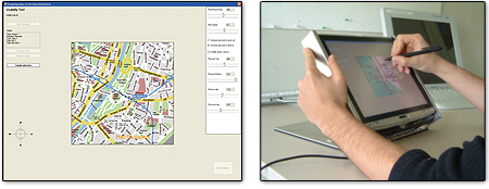
Maps are currently the most common application domain for ZUIs. Standard techniques for controlling such interfaces on pen-operated devices usually rely on sequential interaction, i.e. the users can either zoom or pan. A more advanced technique is speed-dependent automatic zooming (SDAZ), which combines rate-based panning and zooming into a single operation and thus enables concurrent interaction. Yet another navigation strategy is to allow for concurrent, but separate, zooming and panning. However, due to the limitations of stylus input, this feature requires the pen-operated device to be enhanced with additional input dimensions. We propose one unimanual approach based on pen pressure, and one bimanual approach in which users pan the view with the pen while manipulating the scale by tilting the device. In total, we developed four interfaces (standard, SDAZ, pressure, and tilting) and compared them in a usability study with 32 participants.

The results show that SDAZ performed well for both simple speed tasks and more complex navigation scenarios, but that the coupled interaction led to much user frustration. In a preference vote, the participants strongly rejected the interface and stated that they found it difficult and irksome to control. This result enhances previous research, which in most cases found a high user preference for SDAZ, but focused solely on simple speed tasks. In contrast, the pressure and tilt interfaces were much appreciated, which, considering the novelty of these approaches, is highly encouraging. However, in solving the test tasks the participants took hardly any advantage of parallel interaction. For a map view of 600x600 pixels, this resulted in task-completion times comparable to those for the standard interface. For a smaller 300x300 pixels view, the standard interface was actually significantly faster than the two novel techniques. This ratio is also reflected in the preference votes. While for the larger 600x600 pixels view the tilt interface was the most popular, the standard interface was rated highest for the 300x300 pixels view. Hence, on a smaller display, precise interaction may have an increased impact on the interface usability. Overall, we believe that with more extensive user training to encourage parallel interaction and given a redesign to better support precise navigation, the alternative interfaces may have the potential to outperform the standard interface.
Fisheye View versus ZUI
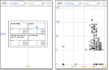
Existing information-visualization techniques that target small screens are usually limited to exploring a few hundred items. In the article below we present a scatterplot tool for Personal Digital Assistants that allows the handling of many thousands of items. The application's scalability is achieved by incorporating two alternative interaction techniques: a geometric-semantic zoom that provides smooth transition between overview and detail, and a fisheye distortion (see figure) that displays the focus and context regions of the scatterplot in a single view.

A user study with 24 participants was conducted to compare the usability and efficiency of both techniques when searching a book database containing 7500 items. The study was run on a pen-driven Wacom board simulating a PDA interface. While the results showed no significant difference in task-completion times, a clear majority of 20 users preferred the fisheye view over the zoom interaction. In addition, other dependent variables such as user satisfaction and subjective rating of orientation and navigation support revealed a preference for the fisheye distortion. These findings partly contradict related research and indicate that, when using a small screen, users place higher value on the ability to preserve navigational context than they do on the ease of use of a simplistic, metaphor-based interaction style.
Overview versus Detail-Only

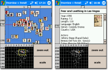
While zoomable user interfaces can improve the usability of applications by easing data access, a drawback is that some users tend to become lost after they have zoomed in. Previous studies indicate that this effect could be related to individual differences in spatial ability. To overcome such orientation problems, many desktop applications feature an additional overview window showing a miniature of the entire information space. Small devices, however, have a very limited screen real estate and incorporating an overview window often means pruning the size of the detail view considerably. Given this context, we report the results of a user study in which 24 participants solved search tasks by using two zoomable scatterplot applications on a PDA - one of the applications featured an overview (see figure), the other relied solely on the detail view. In contrast to similar studies for desktop applications, there was no significant difference in user preference between the interfaces. On the other hand, participants solved search tasks faster without the overview. This indicates that, on small screens, a larger detail view can outweigh the benefits gained from an overview window. Individual differences in spatial ability did not have a significant effect on task-completion times although results suggest that participants with higher spatial ability were slowed down by the overview more than low spatial-ability users.
Zoomable Scatterplot

ZuiScat is a visualization concept for querying large information spaces on Personal Digital Assistants (PDA). Retrieval results are presented in a dynamic scatterplot, which is enhanced by geometric and semantic zoom techniques to provide smooth transitions from abstract visual encodings to data content. The same visualization is also used to manage bookmarks and to serve as a powerful query history tool. User feedback suggests that ZuiScat provides intuitive and efficient data access but still needs further improvement in terms of zoom usability and visual mapping.
Interacting with a Wall-Size Display

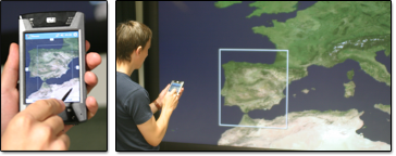
In May 2005 the University of Konstanz set up a Powerwall, i.e. a high resolution wall-size display. I was particularly interested in how users could interact with such a device using PDAs. Together with Joachim Böttger and Vladimir Bondarenko I developed an application that displayed a high resolution image on the powerwall and allowed users to zoom and pan the image via a PDA. The powerwall server denoted the viewport of each PDA client by drawing a colored rectangle on the screen. That way it was possible to observe the movements of all users inside the information space. We found the look and feel of the interaction promising and plan to enhance the functionality.
